Focused research, prototyping, and iterative testing enhanced user interaction and navigation. Improved touchscreen awareness and intuitive wayfinding features increased user satisfaction and efficiency.
Brookfield Properties Retail: Digital Directory Revamp
Overview
Revamped Brookfield Properties Retail's digital directory experience to enhance user interaction and navigation. As the Lead Product Designer, I spearheaded the overhaul through focused research and design improvements.
Role
Design Lead
Duration
January ‘18 — January '20
Tools
Sketch, InVision, Jira, Zeplin
User Problems
Users found locating stores and amenities within the mall using digital directories challenging. They needed to be aware of touchscreen functionalities and found the navigation could have been more intuitive, leading to frustration and inefficient wayfinding.
Business Problems
The existing digital directories needed to be more effective in helping users navigate malls and find stores. This inefficiency negatively impacted the overall shopping experience and tenant satisfaction, leading to user frustration and potential loss of foot traffic to retailers.
User Research
Extensive observational research was conducted at malls, airports, and other locations with digital directories to understand user behaviors and pain points. Additionally, a comprehensive competitive analysis identified best practices and potential improvements. Stakeholder interviews across the corporation and on-site at malls provided insights into key user requirements and desires for the directory experience.
Anyone between 25 - 65 years old
Young professionals, parents, and people who are retired
Any industry
All income levels
Value time efficiency and convenience
“Directories save me time and hassle.”
Observational Research
We conducted detailed observational research with digital directories at various malls, airports, and other locations. This helped us understand how users interacted with the existing directories, highlighting common pain points and behaviors. We noted user frustration when navigating the directories and identified areas where users struggled the most.
Competitive Analysis
A thorough competitive analysis was performed to examine digital directories in similar environments. We identified strengths, weaknesses, and best practices from other systems, which informed our design strategy. This analysis revealed opportunities for improvement in our system, particularly in making the interface more intuitive and user-friendly.
Stakeholder Interviews
Validation
We interviewed stakeholders across the corporation and on-site at malls to gather comprehensive insights into the requirements and desires for the directory experience. These interviews highlighted the importance of ensuring that the directories were easy to use and effective in helping users find their way around the mall.
To validate the user problem, we conducted a series of on-site iPad testing sessions to gather user feedback on the prototype designs. This iterative process ensured that the redesigned interface was intuitive and user-friendly, effectively addressing the identified pain points.
“Without a directory, I often get lost.”
“I always look for a digital directory when I enter a mall. It’s an expectation now.”
Execution
Following extensive user research and prototyping, including on-site iPad testing, a sitemap was developed to prioritize features for a digital directory MVP. The design leveraged existing style elements from B2C websites to expedite development and focused on improving accessibility. Interaction design and UX for the MVP were iteratively tested within the company. Post-launch, on-site evaluations, and user feedback led to several enhancements. The incorporation of analytics resulted in increased wayfinding satisfaction scores and session times.
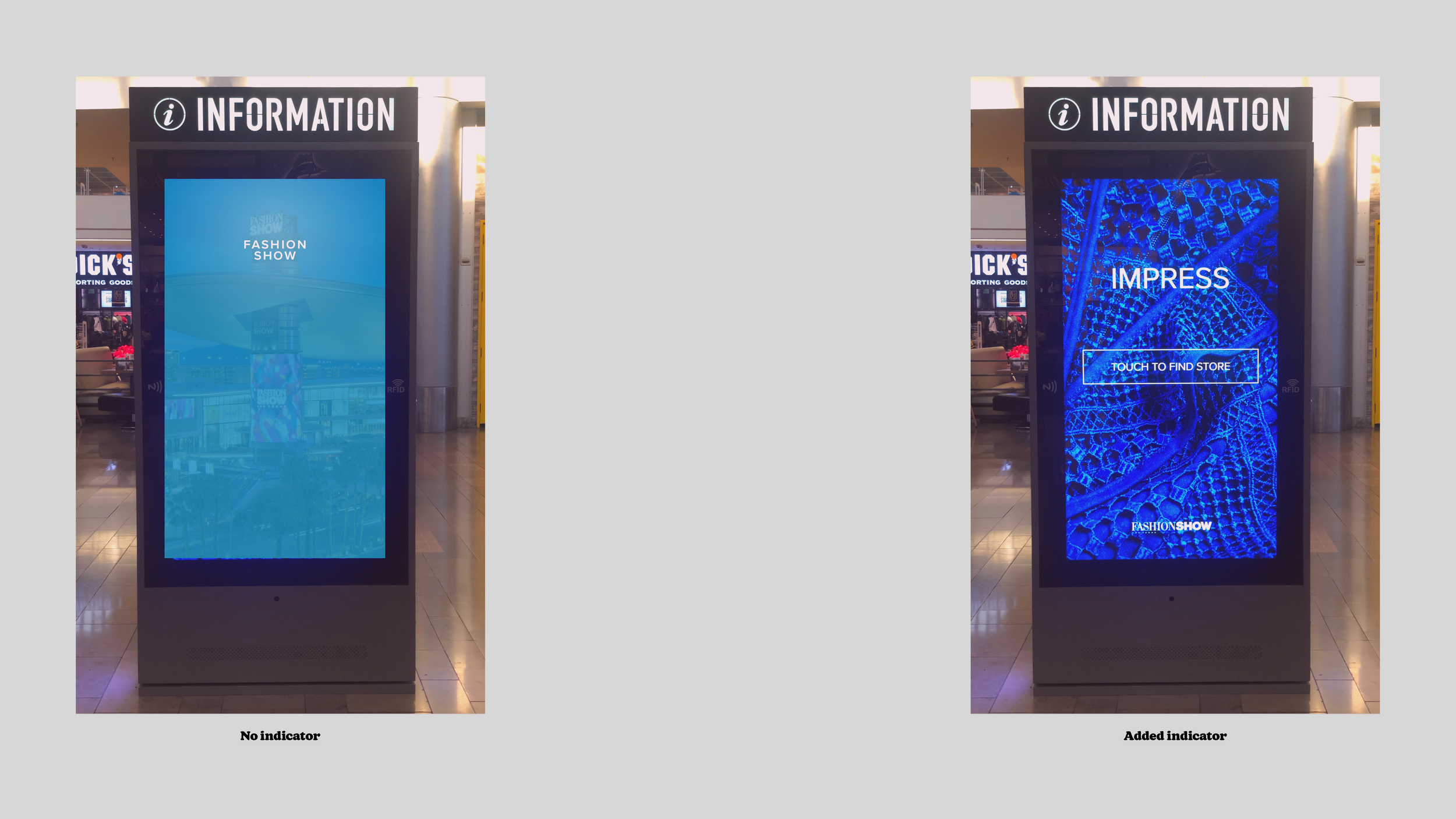
Testing Directory Use
Many users needed to be made aware of touchscreen functionalities, which limited their interaction with the digital directories. Educating users about this feature was expected to improve navigation and satisfaction.
Initial State
Initial interface with no touchscreen awareness indicator.
Users struggled and often did not engage with the directories.
Test
Introduced clear touchscreen indicators.
Result: Increased user interaction and satisfaction, but still some confusion remained.
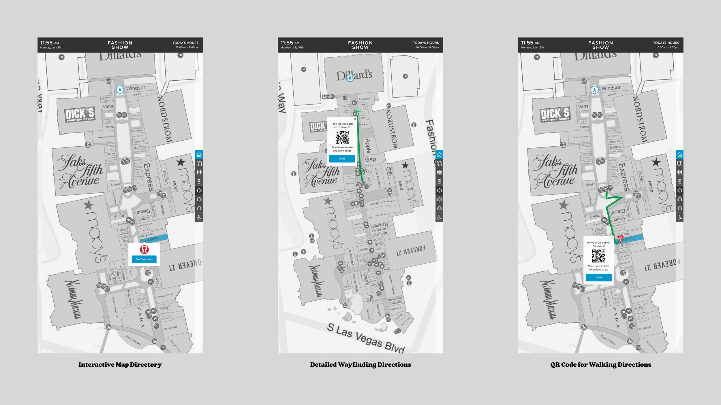
Testing Wayfinding
The existing wayfinding features could have been more effective, making it difficult to locate stores and amenities. Enhancing these features was expected to improve user experience and satisfaction.
Initial State
Original wayfinding system with basic directional cues.
Users reported difficulty in navigating and finding specific locations.
Test
Added more intuitive cues and the ability to take directions through a QR code.
Result: Users found navigating easier, leading to higher satisfaction scores.
Takeaways
A-B Testing revealed that educating users about touchscreen functionalities and enhancing wayfinding features significantly improved user interaction and satisfaction. This confirmed the hypothesis that better communication and intuitive design would address the key user problems.
Ideation
We conducted focus group interviews to get feedback on various design concepts. Using a value/effort matrix, we identified that clear touchscreen indicators and enhanced wayfinding features were the most feasible and valuable improvements.
Testing Concepts
Educating users about touchscreen functionalities and enhancing wayfinding features significantly improved user interaction and satisfaction. A-B Testing confirmed the effectiveness of these design improvements.
Touchscreen Awareness
Visual indicators that clearly show touchscreen capabilities.
Improved user interaction and reduced confusion.
Wayfinding Features
Intuitive directional cues and clear, easy-to-read signage.
Simplified navigation and improved user satisfaction.
Tradeoffs
Initially planned to focus on touchscreen awareness and basic wayfinding enhancements, we scoped out additional features to ensure a streamlined and focused MVP. Post-launch feedback led to further refinements.
Impression
Post-launch, users reported significantly improving their ability to navigate the malls. Analytics showed increased wayfinding satisfaction scores and longer session times interacting with the digital directories.
Final Thoughts
The success of this project underscored the importance of user-centered design and iterative testing. Initially, there were concerns about whether users would engage with enhanced digital directories. The project demonstrated that with the right improvements, users are more than willing to embrace interactive directories that make their shopping experience more efficient and enjoyable.


